A Graphical Play in Three Acts
bySince graphical information manages to fail less spectacularly at getting people to change their minds, here are three graphs; one addressing what we ought (not) to do, one addressing what we are doing, and the other what we can do.
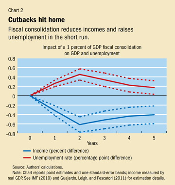
The first comes from the IMF, compiling 30 years of evidence showing that fiscal contraction reduces both employment and incomes:
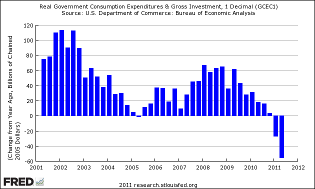
The second is a graph of changes in government purchases of goods and services in the US, showing dramatic fiscal contraction in a very crucial part of government spending:
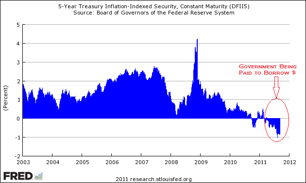
The third is a graph of the real rates on 5-year Treasuries, showing that the federal government can borrow at negative real rates to reverse the above fiscal contraction:
I’d like to say more, but the research suggests that doing so in non-graphical form might be counterproductive.


