How Tight Have ECB Policies Been in Real Terms?
byReaders may have seen two charts that are part of a column by David Wessel published last week. For five European countries, they compare actual interest rates with those prescribed by a standard policy rule. Wessel’s charts provide some interesting evidence that European Central Bank monetary policy has been either too loose or too tight most of the time for several currently ailing European economies, given these countries’ inflation rates and gaps between actual and potential output. Wessel’s charts support the article’s theme, which is that severe economic problems in some Eurozone countries result in part from the “one-size-fits-all” interest rate policies of the ECB.
Along the same lines, at the top of this entry is a chart of short-term “real interest rates” faced by business borrowers who use overdraft loans in a group of European countries, which are mostly members of the euro area. I have used data on interest rates for this common type of loan, adjusting each month’s observation to reflect the same month’s measured consumer price inflation, so that the resulting “real rates” take into account inflation’s effects on the burden of loan payments. Inflation is helpful to debtors because it has the effect of reducing the amount of goods and services represented by each dollar owed under the terms of a loan. Of course, I have used only one of many possible methods that one could employ to approximate real interest rates. Moreover, to construct a true real interest rate data series, one would need to know borrowers’ forecasts of the inflation rate, which is an impossible requirement in most circumstances. Hence, these series and others like them usually need to be taken with a grain of salt.
As theory would have it, real interest rates in different countries tend over the long run to converge on a common value, a result known as “real interest rate parity.” This convergence is assured only under certain exacting conditions that are clearly not met in the case of the numbers depicted in the chart. Nonetheless, the degree to which the rates differ may provide another indication of the disparities in credit costs that are imposed by a unified central banking system. Moreover, the chart shows that some of the countries now experiencing fiscal crises have been suffering the effects of particularly tight credit conditions. For example, Greece’s real interest rate was 20.49 percent in January, as indicated next to the green line representing the Greek data. Real rates for Ireland and Portugal, two other countries whose governments’ financial problems have recently been in the news, are also shown in the figure.
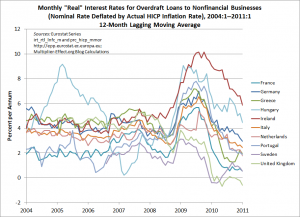
My next chart shows lines for all of the aforementioned countries, plus 7 others, containing points that are constructed by averaging the last 12 months’ observations from the first chart. This removes most of the effects of regular seasonal patterns and helps to highlight longer-run trends, which would otherwise be obscured by the extreme volatility of these series. As a result, we are able to include data for 10 European nations in this figure.
The data underlying the figures are harmonized European statistics, which are meant to be somewhat comparable across national boundaries. Nevertheless, the ten series in the figure seem to show no signs of converging, though their movements appear to be highly correlated over the past three years. According to the averaged data, Irish real interest rates have been the highest among the 10 European economies represented in the graph since approximately spring 2009. In January, the unaveraged real rate in Ireland exceeded 9 percent.
Like Wessel’s diagrams, the ones above show that despite centralized interest-rate setting, one measure of the tightness of policy for actual retail borrowers varies greatly across eurozone economies.
Notes:
Minor clarifications were made to this post at approximately 7:40 am on March 25, 2011 by G. Hannsgen.
Also, as noted in a subsequent post, major corrections to the figures above were made by the author on March 29, 2011 at around 9 am. The text was revised accordingly. We apologize for the errors in the original post. G. Hannsgen
To better reflect the updated information in the new charts, one additional correction to the wording of the text above was made later in the day on March 29 by G. Hannsgen. Further minor corrections to the second figure were made by Hannsgen at approximately 11:50 am March 30.


